Monday, December 13, 2010
New Work, New Sizes this Spring!
Come out this spring and see new work and new larger sizes (34" x 34" square prints and 24" x 51" panos) I'm very excited to show my work at this size that I've always wanted to create!
Monday, April 26, 2010
Magic City Art Connection/ Spider Martin Award!
Just got back late last night from the Magic City Art Connection in Birmingham, AL! We had a fantastic show there, the people were interested, talking about art, talking with artists, and most importantly for the future of independent artists everywhere, buying art! I was very honored to receive the Spider Martin Award for Photography from juror Dan Tague! The weather was a little crazy on Saturday (potential tornadoes) so the closed the show entirely. Not being one to tempt fate I took everything down Friday night, packed it in the car and drove home. Then on Sunday morning at 4 AM I drove back to Birmingham, set the whole thing up again and enjoyed another beautiful day! As I said it turned out to be a great show in spite of the absence of a Saturday. With the award comes an invitation back for next year so I'm already looking forward to going back to Alabama!
Saturday, April 24, 2010
Signe!
I spoke to my friend Signe yesterday at the Magic City Art Festival in Birmingham, AL and she informed me, to my amazement, that she had seen some of my new work on this blog! I was under the impression that nobody ever read this thing. So, as a tribute to my friend Signe and as a treat for those others of you that may be reading this without my knowledge, I'd like to take this opportunity to introduce you to her work!
Since the very first time I met Signe I've absolutely loved her paintings. They are scenes that feel familiar, like you could walk into them and feel right at home. Anonymously. I love the way she uses layers of simple paper cut out-looking flat paint on top of beautifully organic streaks of color. The "snapshot" feel of the compositions allows every viewer to relate to the subjects. I'm not an art writer so I'll stop trying and let the images speak for themselves.


To see more of Signe's work visit her web site here: http://www.galleryair.com/signe.htm
Since the very first time I met Signe I've absolutely loved her paintings. They are scenes that feel familiar, like you could walk into them and feel right at home. Anonymously. I love the way she uses layers of simple paper cut out-looking flat paint on top of beautifully organic streaks of color. The "snapshot" feel of the compositions allows every viewer to relate to the subjects. I'm not an art writer so I'll stop trying and let the images speak for themselves.
To see more of Signe's work visit her web site here: http://www.galleryair.com/signe.htm
Monday, March 29, 2010
Mulberry Street Show, Macon, GA

Tuesday, March 23, 2010
Show Update/ First Prize for Photography!
I just got back in town from the Eastern Shore Art Center's Outdoor Art Festival in Fairhope, AL. For those not familiar with the area, it's the little tip of Alabama that juts out into the gulf of Mexico. It's a really beautiful part of the country and worth a visit if you ever have the time. Anyway, the show was a lot of fun even though the wind on Sunday was a little sketchy. I was happy to receive the first prize for photography award among some really great competition! I got a lot of great feedback for my newest works too which I was showing there for the first time ever! Next Tia and I are on to Macon for the Cherry Blossom Festival this weekend! Let's hope the weather holds out!
Monday, March 15, 2010
Upcoming Shows
Check the show schedule for upcoming shows! Just got positive jury results for Decatur Arts Festival and Central Pennsylvania Festival of the Arts, two of my favorites!
Monday, March 8, 2010
Music Monday
OK, so I got a little distracted by the new work and never even started doing a music Monday so here it is. I think what I'll do for now is lists, like in High Fidelity (one of the best books I've ever read I might add) So here goes, my first top five:
Top Five all-time best 80's albums (how's that for a starting point?!)
5. Prince, Purple Rain- Front to back one of the most solid albums ever, not just the Eighties. Once I heard a quote from Prince when someone asked him what kind of music he listened to and his answer was "I only listen to my own music" (paraphrasing) but it was so cocky and so arrogant but then again, he's Prince. You can't argue with that.
4. The Police, Synchronicity- You may not even realize how many songs that you know and love came off of that one album. Synchronicity, Walking in your Footsteps, Every Breath you Take, Wrapped Around you Finger, Tea in the Sahara, etc. This is their masterpiece. If you don't have it, go get it! NOW!
3. REM, Murmur- You've probably forgotten by now with over 20 studio, compilation, and live releases, that REM was once the original "indie" band. Although they called it "college radio" back then. But Murmur is not only one of the best of the Eighties, it was also, at the time, something completely new and truly "alternative". Not to mention it was a debut album! Not bad for a little Athens, GA band.
2. Paul Simon, Graceland- This one blew my mind when I listened to it for the first time. It was the first experience I'd had with any of these African rhythms used in pop music. Probably the first time anybody had experienced it! Paul Simon was and continues to be on the edge of what is popular in music but it always seems like the rest of the wave is behind him. A true innovator, and this was an incredibly powerful and moving album!
1. Michael Jackson, Thriller- And no, I'm not just jumping on the bandwagon because the guy just died. Say what you will about Michael but there is no denying that the man had a gift! And Thriller was, I would venture to say, the apex of his career along with the single most recognizable music from the 80's. Yeah, it's sort of expected but it's expected for a good reason. This album is one of the most well written, well produced, and well executed albums not only of the 80's but, I'd say, in the history of pop music! Way to go Mike! You're at the top of my list, now you know you've really made it!
Sunday, March 7, 2010
Some more new work!

Monday, February 22, 2010
More New Work...


placed the two images on top of each other and scanned the chrome film (slide film) through both images at once. The result i think is one interesting image from two not so interesting ones. I'll be printing it at 30" x 30" for the gallery edition, I think that size will make for a very striking graphic image.
Please feel free to leave any comments and critique, I've got pretty thick skin.
Friday, February 19, 2010

Phirst Photo Phriday!!
So if this is something I'll want to continue doing then I suppose the best way to start would be with the great master photographers of the 20th century. There are many, but I don't suppose there are any greater in my mind or as an influence on what I do than Harry Callahan. Here is a brief bio that seems to be accurate:


 Above is bar none my favorite Callahan image of all time! And up there in the list of top photographs of all time. The beauty of this image again is it's simplicity. Upon first glance I, and I think most people, assumed it was a pen and ink drawing. A simplified sketch of the female anatomy maybe. But on further inspection you realize it's a photograph! It's a lonely little weed set against a stark white sky! An absolutely beautiful example of how simplicity can be so striking and powerful in art. My photograph below was actually made before I had any knowledge of the weed photo from Callahan, but again, my intentions were almost identical. I admit though, his was a much better solution! None the less, simplicity is the name of the game in both images.
In the end what I really love about Callahan is his willingness to experiment. He was not a trained photographer so he wasn't restrained in what he did. He tried it all, even if that meant his work was a little disparate. He enjoyed photography and that I think is why I feel such a bond to him. I love what I do and I hope that it comes through in my images as it does in his. Here are a couple of other Callahan images that I've always loved that further illustrate that point. Thanks for reading!!


Born in Detroit, Callahan studied at Michigan State University before going to work for the Chrysler Motor Parts Corporation. In 1936, he married Eleanor Knapp, who later became the subject of some of his most important images. Callahan bought his first camera in 1938, and credits Ansel Adams' visit to the Detroit Photo Guild in 1941 as pivotal in his decision to become a photographer. Although he had almost no formal artistic training he received encouragement early in his career from such luminaries as Alfred Stieglitz and Edward Steichen. At the invitation of Laszlo Moholy-Nagy, Callahan joined the staff of the Institute of Design in Chicago (later known as the Institute of Design, Illinois Institute of Technology) in 1946. In 1948 his work was exhibited at the Museum of Modern Art, New York.
Callahan left Chicago in 1961 to establish a photography program at the Rhode Island School of Design. There he was joined by Aaron Siskind (who had been a colleague at IIT). Callahan was chair of the Department of Photography until 1973 and continued to teach at RISD thru 1977.
As for influencing me personally, his images have been a source of inspiration since very early in my photography career. It was some time in 1997 that I began my first college level photography course at the University of Georgia with Dr. Robert Nix. Dr. nix was, at the time, in the latter years of life and of his career. He was a kind old man with a bald head and what hair remained was white as snow. Although I was never told this directly I believe he was being pushed out of the photography department to make room for the new, Yale photography graduate school-educated photographer that made the University look better. But he knew something about photography that none of my other professors ever manged to convey to me. He knew about the importance of simplicity, the beauty of what's not included as opposed to having it all thrown in your face. He was the first person to show me the work of Harry Callahan and I will forever be grateful to him for that. So I'd like to leave it at that and try and convey what I mean with images. I'm going to show some of Callahan's images and if it's appropriate, some of mine to show his influence on my work.


This is an example of what I really love about Harry Callahan. When he made this picture you might think that he was interested in the structure of all of these windows, in their similarities, but i think he was interested not in that but in what made them different! The subtleties of the differences in their shapes, their reflections, and even in their spacing. He took something that people pass by every day and if they think about it at all, they think it's a bunch of windows, exactly the same. He took that framed it and made you look at the differences. It's the same thought I was having when I made the Perfect Blue Buildings photograph. It's a seemingly repetitive pattern but the really interesting things are the small pieces, the tiny lines like no other in the image, that make it work. Obviously, I am more a color photographer and Harry, if I may be so bold as to call him by his first name, was a black and white photographer but I think our intentions were the same.

 Above is bar none my favorite Callahan image of all time! And up there in the list of top photographs of all time. The beauty of this image again is it's simplicity. Upon first glance I, and I think most people, assumed it was a pen and ink drawing. A simplified sketch of the female anatomy maybe. But on further inspection you realize it's a photograph! It's a lonely little weed set against a stark white sky! An absolutely beautiful example of how simplicity can be so striking and powerful in art. My photograph below was actually made before I had any knowledge of the weed photo from Callahan, but again, my intentions were almost identical. I admit though, his was a much better solution! None the less, simplicity is the name of the game in both images.
 In the end what I really love about Callahan is his willingness to experiment. He was not a trained photographer so he wasn't restrained in what he did. He tried it all, even if that meant his work was a little disparate. He enjoyed photography and that I think is why I feel such a bond to him. I love what I do and I hope that it comes through in my images as it does in his. Here are a couple of other Callahan images that I've always loved that further illustrate that point. Thanks for reading!!


Thursday, February 18, 2010
Music Mondays, Photo Phridays
So I think I need some sort of structure here or I will probably find it hard to continue writing on any regular basis. What I've decided to do it take the two thing in this world that inspire me more than any other and write a little bit about them on regular (possibly weekly) basis. Thus Music Mondays and Photo Phridays! If it's not abundantly obvious, what this means is that Each Monday I will write about what I've been listening to and in what way, if any, it has affected my work. Then on Phriday I'll be looking at another Photographer and talk a bit about their work. Now, I'm not a writer per say so it may just be a link or images or whatever but regardless if your into photography or music it might be worth a look.
Monday, February 15, 2010
Working!!
I'm happy to report that I was able to get into the studio and start work on a few photographs that have been knocking around in my head for months now! Sounds like it wouldn't be that big of a deal, right? Well, try two kids, one on the way, being a stay-at-home dad, and running a business from home; that seems to take care of most of your free time. Anyway, my sweet wife Tia was super thoughtful and amazingly understanding and took the kids to Grandma's on Valentine's day so I could have a little time to work! I am truly a very lucky guy! And the film is going out today so i should have new work to share in the next couple of weeks! Hooray!
Friday, February 12, 2010
In my opinion...
I have opinions about a lot of things, ask my wife. Some of them are well thought through and informed and others, OK most, are intuitive reactions to whatever circumstances brought them about. But if there is one subject about which I feel like I have an authoritative position based in experience, it's photography. Of course being art it's all objective but there are so many photographic images out in the world today that I feel like some lines need to be drawn between what is art, the result of a creative process, and what is not art but just a series of filters in Photoshop or a setting on the digital camera used to make a really poor image look otherworldly and therefore "artistic".
The source of my discontent: HDR! HDR stands for High Dynamic Range photography. Basically it's just a new toy for digitographers. (Digitographers, by the way, are camera-users who have more money than talent. Basically, the gear heads of the camera world. Digitographers do not have to be using a digital camera and there are plenty of folks that do use digital cameras that are not digitographers.) OK, now that that's clear let me get back to HDR. The argument is that HDR allows the camera to "see" a wider gamut of tonality and contrast therefore lending a more realistic view to the final image. It's true that film does not perfectly represent what the human eye captures but that is largely due to the fact that the eye is constantly readjusting to various lighting situations. But take a look and decide for yourself. Here are two images, both shot at the same time, on the right showing the raw capture of the camera, the left side the HDR version. You tell me which is more realistic? It's not to say that the picture on the right is a perfect representation of what the human eye perceives but if your world looks like the one on the left you might want to have your rods and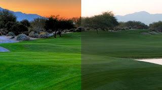 cones checked.
And like I mentioned before, the bigger issue is not that the image has been altered, but that the image is relying on the alteration to make it seem like something more than it is! Lord knows there are plenty of photographers in the world who alter images in a creative way to enhance an image. From Ansel Adams to Jerry Uelsman photographers have used their tools to make an image more interesting. The difference is that these photographers started with a well designed, nicely crafted photograph that would have stood on it's own and used these tools to make it something more. The digitographer just presses a button.
And it gets worse! Here are just a couple I found looking online that are really bad!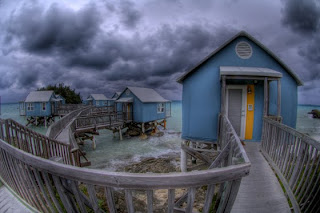
Ewww! Super-wide distorted angles and HDR! A horrible combination!
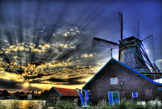
Then there's this one! Look at the area around the windmill, you can see what looks like dodging marks! There's no reason for that, it's just obnoxious! It looks more like a cartoon than a photograph.
I think that just like any other tool there is a learning curve with HDR, and I suspect that right now there are a few photographers out there using it in a restrained manor that are making beautiful images with it. But until the novelty wears off and the price tag goes down these types of images will dominate. My goal is not to call anyone out, it's just to advise. Beware, be aware that these images are out there. Don't be lured into mistaking quality image making for a cheap trick. Be advised, there is now a distinction between a photographer and a digitographer!
The source of my discontent: HDR! HDR stands for High Dynamic Range photography. Basically it's just a new toy for digitographers. (Digitographers, by the way, are camera-users who have more money than talent. Basically, the gear heads of the camera world. Digitographers do not have to be using a digital camera and there are plenty of folks that do use digital cameras that are not digitographers.) OK, now that that's clear let me get back to HDR. The argument is that HDR allows the camera to "see" a wider gamut of tonality and contrast therefore lending a more realistic view to the final image. It's true that film does not perfectly represent what the human eye captures but that is largely due to the fact that the eye is constantly readjusting to various lighting situations. But take a look and decide for yourself. Here are two images, both shot at the same time, on the right showing the raw capture of the camera, the left side the HDR version. You tell me which is more realistic? It's not to say that the picture on the right is a perfect representation of what the human eye perceives but if your world looks like the one on the left you might want to have your rods and
 cones checked.
And like I mentioned before, the bigger issue is not that the image has been altered, but that the image is relying on the alteration to make it seem like something more than it is! Lord knows there are plenty of photographers in the world who alter images in a creative way to enhance an image. From Ansel Adams to Jerry Uelsman photographers have used their tools to make an image more interesting. The difference is that these photographers started with a well designed, nicely crafted photograph that would have stood on it's own and used these tools to make it something more. The digitographer just presses a button.
And it gets worse! Here are just a couple I found looking online that are really bad!

Ewww! Super-wide distorted angles and HDR! A horrible combination!
Then there's this one! Look at the area around the windmill, you can see what looks like dodging marks! There's no reason for that, it's just obnoxious! It looks more like a cartoon than a photograph.

I think that just like any other tool there is a learning curve with HDR, and I suspect that right now there are a few photographers out there using it in a restrained manor that are making beautiful images with it. But until the novelty wears off and the price tag goes down these types of images will dominate. My goal is not to call anyone out, it's just to advise. Beware, be aware that these images are out there. Don't be lured into mistaking quality image making for a cheap trick. Be advised, there is now a distinction between a photographer and a digitographer!
Wednesday, February 10, 2010
The news
Gearing up for the coming show season!! It's going to be a busy one, first off there's a new Turco heading our way in early May (Spring show season peak) but I guess I should have thought of that before. We are very excited for our third to arrive. In the mean time though we've got to make some money! Tia (my wife) is taking a year off from teaching obnoxious, ungrateful teenagers to be with the baby and the rest of the family. And she's begun her career as an artist making beautiful sterling silver and resin jewelry to fill in the financial gap that will leave. Check out her Etsy site here. So for those of you who are counting, yes, that means two artists, three kids, four animals, one mortgage, and no "real" jobs. Are we crazy? Probably. Are we going to look back on this is twenty years and say thank god we took a chance and enjoyed our kids while they were young? Definitely!
So here's the low-down: The economy sucks so shows are slower, so we are doubling up and doing a lot more shows this year! Some will be just me, some will be just Tia, and some will be both of us! So far this is what we know about:
March 19-21, Eastern Shore Art Festival, Fairhope, AL (Greg)
March 26-27, Mulberry Street Festival, Macon, GA (Greg & Tia)
April 9-11, Artrider, Morristown, NJ (Greg)
April 23-25, Magic City Art Connection, Birmingham, AL (Greg)
Then we take a little break to birth a baby in early May!
I will post more of the Summer schedule as it solidifies. I hope that you can come visit at a show or two. It's one thing to see artwork online but to really get the whole idea you need to see it in person! So come on out, forward this message on to your friends and family, and be sure to also visit my Etsy site for new and different listings all the time!
Monday, February 1, 2010
Robert Parke Harrison
 Robert Parke Harrison is without question one of my favorite contemporary photographers. His work straddles a delicate line between fantasy and reality without any of the modern issues of looking over manipulated. That's because he does it the old fashioned way, making multiple paper negatives and fusing them together in the darkroom. The old processes used in the final print add to the authenticity. Check out his site here: http://www.parkeharrison.com/
A true modern master!
Thursday, January 28, 2010
I've got an idea...
As I struggle with establishing myself in the online marketplace (Etsy) I keep thinking that I'm missing a piece of the puzzle. I'm trying to keep this blog, although sometimes I struggle with what I'm supposed to write and to whom I'm writing (hi Sarah!). I'm trying to draw people to my shop by being active on Flickr, and lord knows my friends on Facebook are sick of hearing about my most recent addition. So the other day I started trying to think about the problem in a different way. What I want as a seller is the largest concentration of the buying public looking at my work as possible, what I'd really like is to have a day where all the people who are specifically looking for fine art to hang on their wall would have a central location where they could see just that. Etsy is wonderful but let's face it, it's next to impossible to weed through everything and really be able to find something you want, much less something that really speaks to you. Which brings me to the second part of the equation, the buyer. From a buying standpoint, especially a new buyer, Etsy is a maze of everything from worthless junk to really wonderful, useful, beautiful art. Don't get me wrong there are a lot of different opinions about what is art and I'm happy to let everyone have their own, but I think as Etsy grows larger there is a need to compartmentalize some things.
So I'll get to the point. I want to create a group, a team, on Etsy called the Professional Artists Consortium (PAC). The idea is simple. Basically it is a juried or by invitation only group consisting of high-caliber Etsy fine artists. Once the group has reached a certain number of members (say 200 to start) we would begin showing our work in an online art fair format in a central location at a specified time. In other words think about the look of itunes in the album cover view but instead of individual images you are scrolling through an artist's virtual booth. You can glance at it, move on to the next one, or if you find something of interest clicking on an image takes you to their Etsy page in a separate window. This "event" would be publicized by all the vendors and by PAC as a whole. That way the whole group benefits by each individual's efforts and each individual benefits by the group's efforts.
In the end the hope is that PAC becomes a badge of honor for artists and helps generate sales by combining the works of many fine artists in a format that is easily navigated by art buyers.
Wednesday, January 27, 2010
Tuesday, January 26, 2010
 I thought an appropriate way to start this blog would be to talk about this image for a minute. I made this photograph, called "Bedsprings" in 1999. At the time I was in the midst of a project working inside abandoned houses. For me the idea of the project was to make photographs without affecting the scene in any way. In other words I never placed anything, never used artificial light, and nothing was ever removed. So in this case the springs were leaning against the wall just like this. Over the years since I shot it, this photograph has grown to be sort of iconic to me. And for lots of people I meet doing the art show circuit, it's how they remember who I am. I can't count the number of times I've heard "oh, you're that bedsprings guy" or something to that effect.
 I think what draws so many people into this image is it's various juxtapositions. It's simple but it's very complex, it's old and rusty but somehow very fresh and new, it all about line on one hand but all about that color on the other, it's a photograph, but it reads almost like a pen and ink drawing from a distance. There is also something almost meditative about it that I've always noticed. In fact I have this image in our bedroom and often find myself staring at it while I'm thinking about one thing or another. It's easy to get lost in all those circles.
Monday, January 25, 2010
Welcome to the Turco Photography Blog! Please take a minute to look at my web sites:
Greg Turco Photography
TurcoArts on Etsy
TurcoPhoto on ArtFire
Thanks-
Greg
Greg Turco Photography
TurcoArts on Etsy
TurcoPhoto on ArtFire
Thanks-
Greg
Subscribe to:
Posts (Atom)


